GPT Image 2.5: Flare, Sunburst, and 12 Prompts
GPT Image 2.5 feels like a useful upgrade, though the biggest difference in my informal use has been speed. I have not seen a dramatic jump in fine detail over GPT Image 2. For anyone looking for practical GPT Image 2.5 prompts, my advice is to start with a real job: a product shot, a poster with exact text, or an edit that must leave the rest of the image alone.
There is also an important distinction behind the release: Flare and Sunburst have different goals. That makes a blanket judgment about “2.5 quality” less useful than it sounds.
Documentation checked September 9, 2026. My impressions are informal; this article does not report a controlled GPT Image 2 versus 2.5 benchmark.
Flare vs. Sunburst: which should you try?
OpenAI’s GPT Image 2.5 prompting guide describes the split more clearly than a general promise of better images:
| Model | Official positioning | Where I would start |
|---|---|---|
| GPT Image 2.5 Flare | A smaller model optimized for speed, with image quality comparable to GPT Image 2 | Blog illustrations, social posts, everyday product concepts, and batches of variations |
| GPT Image 2.5 Sunburst | A base model optimized for quality, with higher image quality than GPT Image 2 | Demanding campaign images, detailed product work, and edits where preservation matters |
The same guide says both improve precise editing and subject preservation. Those are vendor claims, rather than conclusions established by the gallery below.
For the API, the IDs are gpt-image-2.5-flare and gpt-image-2.5-sunburst. Both support low, medium, high, xhigh, max, and auto quality settings. A higher setting is worth trying when there is a specific defect to fix; it is not a guarantee that every prompt will look better.
Why speed can matter more than extra detail
The practical benefit of a faster generator is that revisions interrupt the work less. Generate a draft, notice the label is too small, adjust it, then try another crop. When each step arrives sooner, it becomes easier to finish the image while the idea is still fresh.
That matches my initial reaction to this release. The pictures can look good without looking obviously different from the previous generation. For Flare, comparable quality at lower latency is explicitly part of the design.
My suspicion was that the upgrade mostly improved efficiency. That remains a suspicion about the implementation. Faster output alone cannot tell me how much compute OpenAI uses internally, and it does not establish whether Sunburst improves a difficult task I have not tested.
It also does not prove a lower API bill. The Flare and Sunburst model cards list the same token rates as GPT Image 2, while warning that the GPT Image 2 calculator cannot estimate 2.5 token consumption. I would compare cost per accepted image, including retries—the same principle I use for choosing and evaluating AI workflows.
Eight generated examples, with prompts you can reuse
These are original prompts informed by the official prompting guide. The examples were generated for this article through Codex’s built-in image tool. That interface did not expose a model selector or a verified backend version, so these are prompt demonstrations, not authenticated Flare or Sunburst samples. They cannot establish a speed or quality advantage over GPT Image 2.
The fictional people, products, and event below are generated. The sketch is generated too. Each prompt serves a different purpose, and the captions identify what to inspect. Prompts 1–8 produced the eight images; prompts 9–12 are additional ideas without generated outputs here.
1. A product photograph with useful negative space
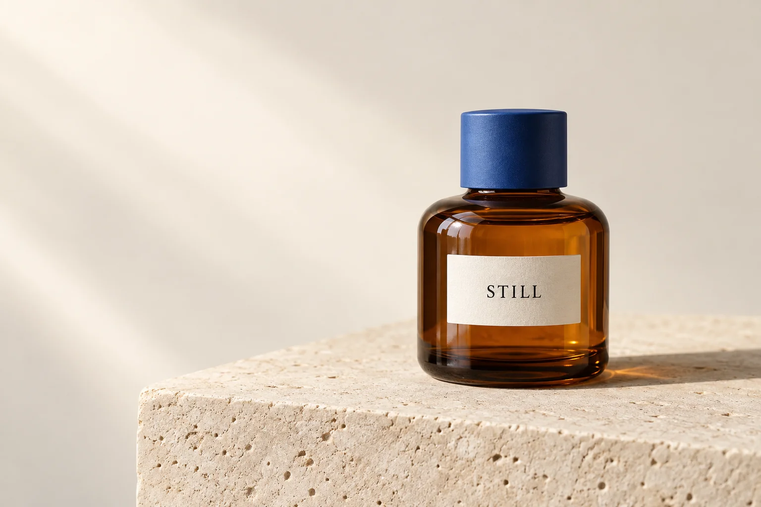
The opening image comes from this prompt. The empty left side leaves room for a future headline, while the bottle gives us glass, paper, stone, and a short label to inspect. “STILL” is readable, and the cap provides a simple target for the later editing example.
Use case: product-mockup. Create a landscape 3:2 premium studio
product photograph of one squat amber glass bottle on a pale
limestone plinth. The bottle has a matte cobalt-blue cylindrical
screw cap and a small cream paper label reading exactly "STILL" in
black uppercase serif letters, once only. The bottle stands on the
right half, with generous empty warm ivory background on the left.
Soft daylight enters from the upper left, creating one believable
shadow to the right. Show subtle glass reflections, fine stone
pores, and a crisp label. Camera at bottle height, natural
proportions. No other objects, no extra text, no watermark.
2. An event poster with exact wording
This prompt supplies the copy directly instead of asking the model to invent it. The output spells all three text items correctly, although “NIGHT MARKET” wraps onto two lines. That is a useful distinction: correct words do not necessarily mean exact layout compliance.
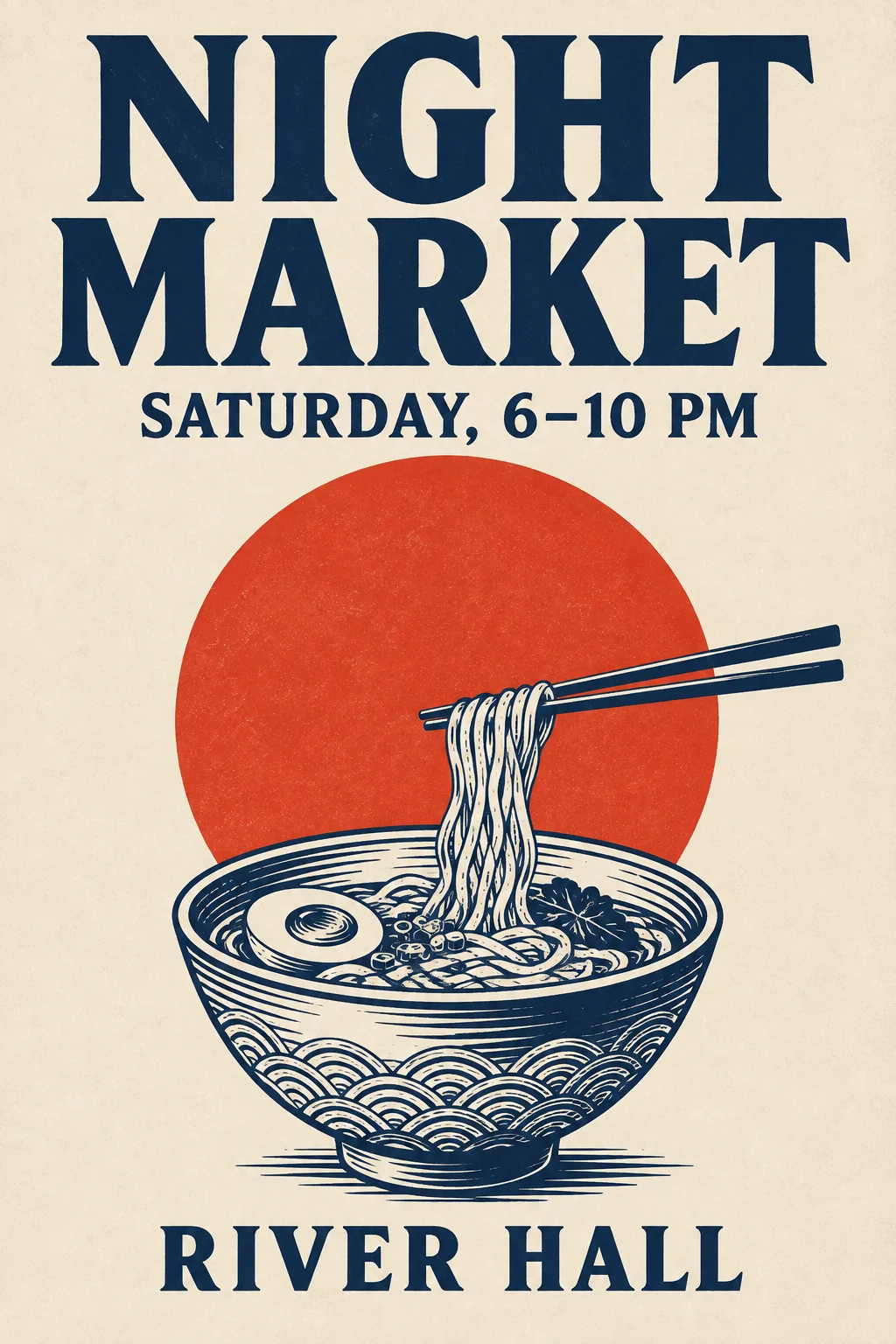
Use case: ads-marketing. Design a portrait 2:3 editorial poster
for a fictional evening food market. Use a warm ivory paper
background, deep navy typography, one large vermilion circle, and
a restrained navy line illustration of a noodle bowl in the lower
third. Make the layout bold and spacious with a clear typographic
hierarchy. Render exactly these three lines, each once: "NIGHT
MARKET" as the large headline at the top; "SATURDAY, 6–10 PM"
beneath it; "RIVER HALL" at the bottom. All lettering must be
sharp and readable. Flat printed graphic design with slight paper
texture, no frame, no other words, no logos, no watermark.
3. A portrait where hands have a job
A person holding an object is more revealing than a face alone. Here, the bowl, fingers, clay dust, and apron all need to belong in the same photograph. The visible skin texture and soft light work well; the points where fingers meet the bowl deserve a closer look before using the image at a large size.
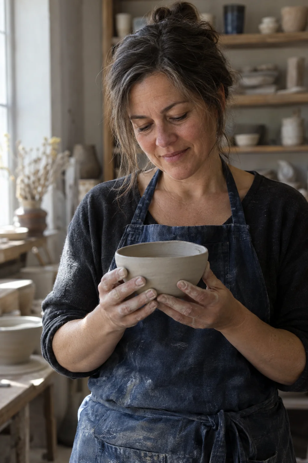
Use case: photorealistic-natural. Create a portrait 2:3 candid
editorial photograph of a fictional middle-aged ceramicist in a
quiet pottery studio. Frame from the waist up at eye level. She
looks down at one small unfinished clay bowl held gently in both
hands at chest height; all fingers should have believable anatomy
and contact with the bowl. She wears a faded indigo apron, with a
little clay dust on her fingertips. Soft window light from the
left, natural skin pores and fine lines, shelves of unfocused
pottery behind her. Subtle film grain, honest colors, no beauty
retouching, no cinematic color grading, no text or watermark.
4. A busy scene with countable constraints
The scene asks for five people with separate roles, plus exactly two cups on the central table. The output visibly includes those five people and two cups. Counting them is more useful than declaring that the model “understands complex scenes.” The umbrella-closing action is less definite in a still frame, so that remains a judgment call.
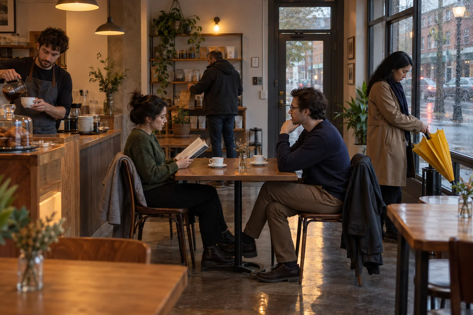
Use case: photorealistic-natural. Create a landscape 3:2
photograph of a small neighborhood cafe on a rainy afternoon,
viewed at eye level from inside near the entrance. Show exactly
five adults: one barista behind the counter on the left pouring
coffee into a white cup; two friends seated opposite each other at
the central table, one holding an open book; one customer by the
window on the right closing a yellow umbrella; and one customer at
the rear picking up a paper bag. Keep their bodies separate and
their actions readable. The central table has exactly two cups.
Warm pendant lights mix with cool window daylight, with believable
wet-street reflections outside. Natural documentary photography,
no dramatic color grading, no readable signs, no extra people or
people in reflections, no watermark.
5. A four-panel comic with a recurring character
For a comic, continuity is part of the assignment. Follow the robot’s eyes, antenna, limbs, and pot through the panels, as well as whether the actions read in the intended order.
The four actions read clearly, and the robot remains recognizable. The first panel appears to show more than one seed, despite the one-seed instruction. Even a charming comic can miss a small, countable requirement.
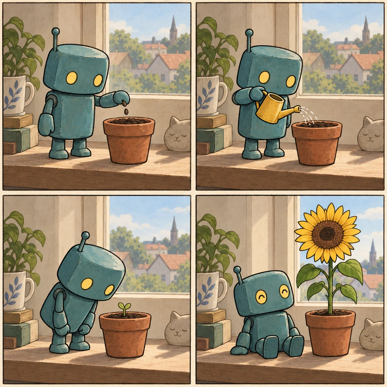
Use case: illustration-story. Create one square comic page in an
exact 2-by-2 grid with four equal panels, read left to right then
top to bottom. Use clean ink outlines, muted gouache colors, and
cream paper. The same small friendly robot appears in every panel:
rounded teal rectangular body, two short legs, two mitten-like
hands, two round yellow eyes, and one short antenna on the left
side of its head. Panel 1: the robot puts one seed into a small
terracotta pot. Panel 2: it waters the same pot with a tiny yellow
watering can. Panel 3: it leans close to examine one tiny green
sprout in the pot. Panel 4: it sits proudly beside the same pot,
which now contains one large sunflower. Keep the robot design and
simple windowsill setting consistent. Clear panel borders, no
speech balloons, no text, no watermark.
6. Change one color and preserve the product
Use the opening bottle image as the input. This is an actual reference-based edit, rather than a second text-only generation. A narrow change makes unwanted differences easier to spot.
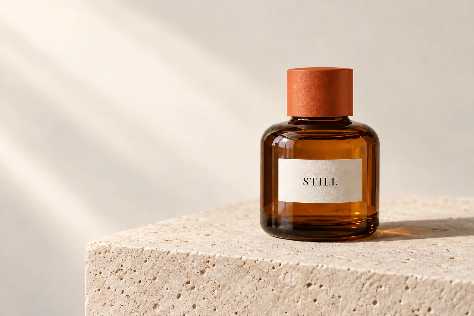
Use case: precise-object-edit. Image 1 is the product photograph
to edit. Change only the matte cobalt-blue bottle cap to matte
burnt orange. Preserve the cap geometry and texture, amber glass,
cream label and the exact word "STILL", bottle position, limestone
texture, reflections, shadow, background, lighting, crop, and
dimensions. Do not add or remove anything. Keep every other detail
unchanged.
Compare the label, bottle outline, reflections, and stone surface with the opening image. “Keep everything else unchanged” is a requirement to check, not a promise of pixel-identical output. OpenAI’s guide explicitly notes that repeated edits can still alter details that should remain fixed.
Here, the cap changes to orange and the bottle and label remain recognizable, but the stone’s fine texture changes too. The edit succeeds at the main request while falling short of strict preservation.
7. Make a simple sketch to use as an input
A sketch supplies spatial decisions that are cumbersome to describe in prose. This generated pencil sketch gives the next prompt a chair, table, and lamp arrangement to preserve.
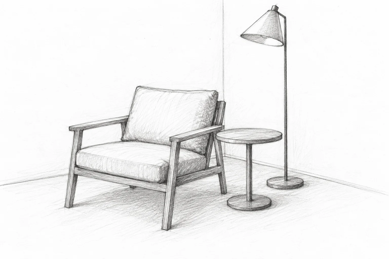
Use case: stylized-concept. Create a landscape 3:2 rough graphite
pencil concept sketch on plain white paper of a minimal reading
corner, with no color and no text. Show exactly three furniture
objects in a coherent three-quarter perspective: a low lounge
chair centered slightly left with one rectangular back cushion,
one seat cushion, a simple exposed wooden frame and four legs; a
small round side table to its right on a single pedestal; and a
slender floor lamp behind the table with a conical shade and round
base. Include the floor-wall corner as two faint lines. Leave the
rest of the room empty. Loose exploratory hand-drawn strokes,
clear silhouettes, no annotations, no people, no plants, no books,
no watermark.
8. Turn the sketch into a furnished corner
Attach the sketch from the previous example. Its role is to control layout; the text supplies the materials and lighting. This demonstrates a sketch-to-render workflow, without claiming to test a particular in-app Sketch interface.
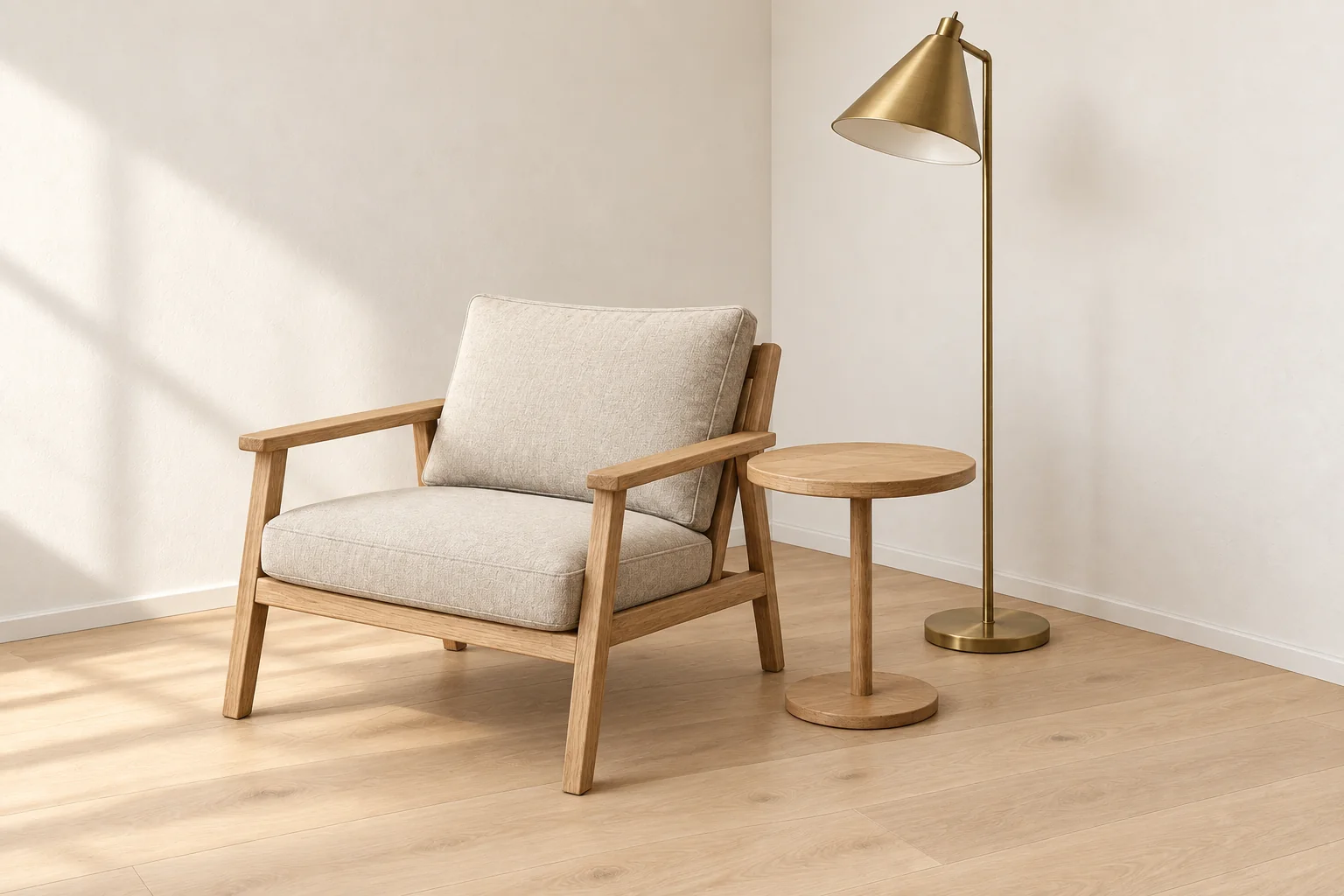
Use case: sketch-to-render. Image 1 is the generated pencil sketch
to use as the layout reference. Turn this sketch into a
photorealistic interior photograph. Preserve the exact camera
angle, relative positions, proportions, chair frame geometry,
cushion shapes, round side table, lamp silhouette, and floor-wall
corner. Use natural oak for the chair frame and table, oatmeal
linen for the cushions, brushed brass for the lamp, warm white
plaster walls, and a pale oak floor. Soft daylight from the left.
Keep exactly these three furniture objects. No people, plants,
books, extra furniture, text, or watermark.
Check whether the result preserves the chair’s frame, the table’s relative size, and the lamp’s position. A beautiful interior can still fail if it quietly redesigns the furniture.
This result keeps the three objects in their intended arrangement and follows the main silhouettes closely. It also adds a baseboard along the wall, a small detail absent from the sketch.
Four more prompts for your next batch
These additional prompts have not been run for this gallery. They extend the same approach to useful everyday assets.
You can also download all 12 prompts as a plain-text file.
9. A food photograph with restrained styling
Create a square editorial food photograph of one slice of lemon
cake on a plain white ceramic plate, with one small fork to its
right. Use a pale blue linen tablecloth, soft morning window light
from the left, and a slightly overhead camera angle. Show moist
crumb texture and a thin layer of icing. Keep the styling simple:
no flowers, fruit props, extra plates, text, or watermark.
10. A travel illustration with room for a title
Create a landscape 3:2 watercolor travel illustration of a quiet
canal in Amsterdam at dawn. Show narrow brick houses, one arched
bridge, and two bicycles parked along the railing. Use muted
terracotta, blue-gray water, and warm paper texture. Keep the
upper quarter mostly pale sky for a title to be added later. No
lettering, logos, crowds, or watermark.
11. A transparent shop asset
Create a square product cutout of one original mint-green over-ear
headphone design, viewed at a three-quarter angle with both
earcups visible. Use matte plastic, soft woven cushions, and
subtle metal hinges. Center the complete object with generous
padding on a fully transparent background. No brand name, text,
solid backdrop, checkerboard pattern, scenery, or shadow.
In the API, also set background="transparent" and choose PNG or WebP. Inspect the actual alpha channel; a picture of a checkerboard does not count.
12. Replace a background while keeping the subject
Requires a product image as input.
Image 1 is the product photo to edit. Replace only the background
with a seamless pale sage studio backdrop. Preserve the product's
exact geometry, position, scale, colors, surface texture, label
wording, and camera angle. Keep the lighting direction consistent
and retain a believable contact shadow. Do not add props, text,
logos, or a watermark.
Point to the change, then say what must stay
OpenAI’s image-generation documentation describes selecting an area and giving targeted feedback, including comments in the image viewer’s Canvas view. That is useful when the problem is easier to point at than to name.
The written instruction still matters. Select the cap and ask for a color change, then specify that the label, glass, crop, and lighting must stay fixed. For a sketch, say which geometry must survive the conversion. The less the model has to guess about the scope of the edit, the easier the result is to assess.
What I would use by default
I would start with Flare for routine images that GPT Image 2 already handles well. I would try Sunburst when a concrete problem remains: lettering, product geometry, a difficult scene, or an edit that changes too much.
To make that decision, run the same prompts and reference images at the same dimensions and an explicitly selected shared quality setting. Repeat a few times, inspect the constraints, and record elapsed time, retries, and cost per accepted result. These eight examples are a starting set of tasks, not the results of that comparison.
For my own work, getting an acceptable image sooner is already valuable. I do not need every release to produce a visibly different style. I need the next revision to arrive quickly—and to keep the parts of the picture I already liked.